Ooup Mobile Application
Project Description
Over the course of one month, I used the Design Sprint Process to develop a solution to a given problem for the fictitious rental scooter company Ooup, which was provided by the instructors. This process normally takes four days (day one: The Concept, day two: The Storyboard, day three: The Prototype, and day four: User-Testing), but I did each day over the span of a week. Our task was to come up with a new product for Ooup and discover if it would be the best solution to our problem and help us reach our long term goal for the company.
THE CONCEPT
Long Term Goal
In two years Ooup will be the most well known and reliable rental scooter service in the city.
Sprint Questions
Can we have scooters available to customers when requested?
Will reserving scooters work?
Can we advertise the benefits and service of Ooup and bring in new customers?
User Story Map
Concept Screen One
Concept Screen Two
Concept Screen Three
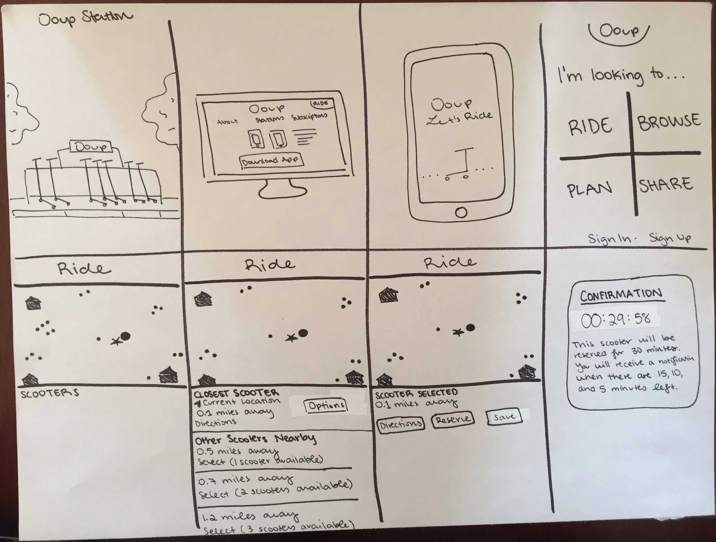
THE STORYBOARD
The User Test Flow
The Storyboard
THE PROTOTYPE
High Fidelity Prototype
THE SUMMARY REPORT
Top Trends
Overall, users were able to complete the given task, except when on the home page
Users seemed to be confused when on the home page. They did not know the difference between “Ride” and “Browse” at first
Long Term Goal Reflection
Ooup will become more well known by people in the city with the use of the “Share” option on the app and marketing campaigns. This feature on the app allows users to refer friends in the exchange for credits and they can also post on social media for special offers. By sharing and telling their friends, Ooup will be used by many around the city. Also, with the help of scooter stations with information and marketing, more people will be aware that Ooup exists. Ooup will be a reliable company because of it’s accurate, user friendly app. The reservations option needs to be very reliable as well as the planning feature. It is more important to keep users happy, if they expect a scooter at a specific date, time, and location, it should be there.
Three Recommended Next Steps
Re-design the home page so that it is not confusing to users
Make the “Closest Scooter” section under “Ride” more clear because users seem to oversee it
Test app again once feedback has been applied before launching
Detailed Prototype Feedback
All users were confused between “Ride” and “Browse” when on the menu
One user would rather open the app and be directed to the “Ride” page with the map and closest scooter showing
The map is helpful and has the information needed
Users overlooked the “Closest Scooter” section, they went straight to the other listed scooters
Missing “Sign Up” option on the “Sign In” screen
Users like the the stations locations list
It was not clear to one user whether the app used current location
The different options for the reservation notifications were liked by some of the users
The orange dots on the map were not clear for one of the users
One user said the font was a little small
The number of scooters option was a little confusing
Users liked how clear the buttons were
Everyone liked the timer after making a reservation
Two users asked about payment options
Skills/Programs:
Prototyping
Branding
Sketching
User testing
Storyboarding
Design Sprint
Adobe Illustrator
Adobe XD


